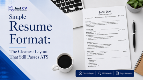
A simple resume format uses a single column, standard section headers, and no graphics or tables. That makes it easier for both applicant tracking systems and human recruiters to scan quickly. It’s not a lesser format – it’s the format that gives your experience the clearest possible path to being read.
Key takeaways
- A simple resume format is single-column, uses standard headers, and skips icons, photos, and tables.
- It isn’t the same as boring – typography, spacing, and one accent color still let it feel like you.
- Graphic-heavy “designed” resumes carry real ATS parsing risk that most template galleries never explain.
- Freshers and career changers often benefit most, since a clean layout puts the story front and center.
- Explore JustCV’s free simple templates – no card required to start.
Why Simple Beats “Designed”
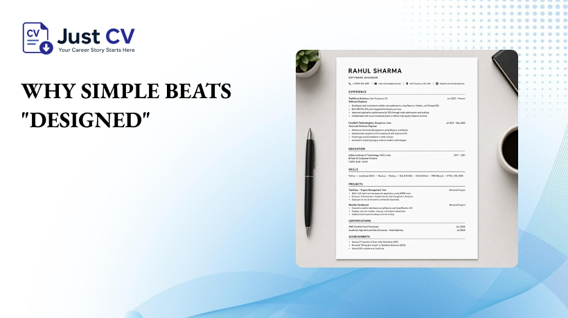
Most articles ranking for “simple resume format” or “basic resume format” focus on selling templates instead of explaining what actually makes a resume effective. You scroll, you pick a layout, you download.
You’ve probably seen the claim that ATS software rejects most resumes before a human ever sees them. That specific number is widely repeated, but it doesn’t hold up – it traces back to an old marketing claim with no real research behind it, not an actual study of how hiring systems work.
Here’s what’s actually true, and checkable. Applicant tracking systems pull text in a predictable order – usually left to right, top to bottom. A single-column layout matches that order exactly. A two-column layout, a text box, or a graphic skills bar can break it, merging your job title with your skills section or skipping a column entirely.
Recruiters face the same scanning problem, just faster and by eye. A clean layout lets a recruiter find your most recent title, dates, and top achievements in seconds. A crowded, design-forward layout asks them to hunt for it.
This is the piece competitor template pages tend to skip. Even resume.io’s own simple-format page – which does explain, briefly, that a “pared-back design sends a quiet but clear message” – stops short of showing why that’s true structurally, or comparing it side by side against a designed layout. Understanding the mechanism is what lets you choose confidently instead of guessing.
Simple format vs. designed format, side by side
| Simple format | Designed / graphic format | |
| ATS parsing risk | Low – text reads in order | Higher – columns, icons, and text boxes can be misread |
| Recruiter scan speed | Fast – familiar structure | Slower – visual elements compete for attention |
| Editing ease | Easy to update quickly | Layout can shift or break when edited |
| Works across industries | Yes – accepted almost everywhere | Better suited to design-specific roles |
What “Simple” Actually Means
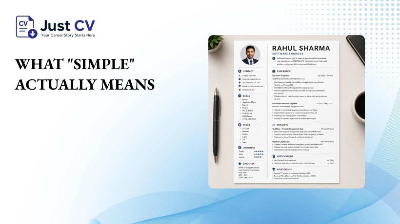
“Simple” isn’t vague. It’s a specific, checkable set of choices. Use this checklist to review your resume:
- Single column – no side-by-side sections competing for reading order.
- Standard section headers – Experience, Education, Skills, not renamed or stylized headers.
- Reverse-chronological order – most recent role first, in each section.
- No photos, icons, or graphics – these add parsing risk without adding information.
- One or two fonts, used consistently – a clear heading font and a readable body font.
- Plain bullet points – no custom bullet icons or shapes.
- Standard file type a text-based PDF or DOCX, not a flattened image.
- Consistent spacing – even white space between sections, no cramped or oversized gaps.
A quick before-and-after
Before (designed, higher risk): Two-column layout. Left column: a circular photo, an icon-based skills bar, a colored sidebar with contact details. Right column: work history in a condensed font.
After (simple, ATS-safe): Single column. Name and contact details at the top in plain text. Sections in order: Professional Summary, Experience, Skills, Education. Consistent bullet points throughout, no icons or sidebars.
Same person, same experience – one version is built to be read by a machine and a human without friction.
Simple ≠ Boring
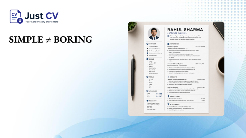
A common worry is that a simple resume format looks unprofessional next to a “designed” one. It doesn’t have to. Simplicity is a structural choice, not a personality choice.
You can still express your own style through:
- Use one accent color only for your name and section headings to keep your resume clean and professional.
- Thoughtful spacing that gives the page room to breathe.
- A confident, well-chosen font pairing (one for headings, one for body text).
- Strong, specific bullet points – the writing itself is where your story lives, not the graphics around it.
This matters most for readers with less traditional experience to lean on. If you’re a fresher, or you’re building your first resume from internships, coursework, and personal projects rather than years of job titles – that counts, and a simple format lets it stand out clearly instead of competing with visual noise for the reader’s attention.
The same logic applies to career changers. A simple layout doesn’t hide a nontraditional path. It presents it plainly, which is often the more persuasive choice – the reader’s attention goes straight to the transferable skills and achievements, not the design.
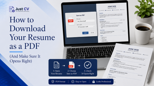
If you want a head start, explore JustCV’s ATS-friendly resume templates to see how a clean structure holds up against automated screening, or check out free resume templates you can download today in PDF and Word if you want to compare a few simple layouts side by side. Once you’ve built one, here’s how to download your resume as a PDF and make sure it opens correctly on the other end.
A simple resume format isn’t a compromise. It’s the version of your resume built to be read – by software, and by the person deciding whether to bring you in for an interview.
Ready to build one? Explore Templates – free, no card required.
FAQs
Should you choose a simple resume or a creative one?
For most applications, yes. A simple format parses more reliably through ATS software and lets recruiters scan quickly. Creative, graphic-heavy formats can work in design-specific fields where visual presentation is itself part of the application.
Does a simple resume look unprofessional?
No. Simplicity is a structural choice – single column, standard headers, no graphics – not a lack of effort. Thoughtful spacing, a strong font pairing, and clear writing keep it professional and personal at the same time.
What’s the difference between “simple” and “basic” resume formats?
They’re closely related. “Simple” usually emphasizes clean visual structure, while “basic” often refers to including only the core sections – contact info, experience, education, and skills – without extra sections like languages or interests.
Can a simple resume format still stand out?
Yes. Standing out comes from strong, specific writing and clear achievements, not from graphics or unusual layouts. A simple format actually gives that writing more room to be noticed.
Is a simple resume format good for freshers with little experience?
Yes, often especially so. A clean layout puts projects, internships, and coursework front and center, without competing visual elements. It’s one of the most reliable formats for a first resume.
Do I need different software to build a simple resume format?
No special software is required. A simple format can be built in any standard word processor or a dedicated resume builder – the key is the structure, not the tool.
Will a simple resume format work for every industry?
Yes, it’s accepted almost everywhere, including finance, tech, healthcare, and administrative roles. Design-forward formats are typically reserved for creative fields like graphic design.